Case Study
62% Increase in Booking Conversions
Redesigning key pages turned more visitors into paying guests.
Redesigned location page
Updated: 13 October 2025
The Project
The Challenge
This global entertainment brand offers immersive fine-dining shows that blend food, theater, and technology. Despite massive social buzz and strong traffic from paid and organic channels, their site wasn't converting as it should.
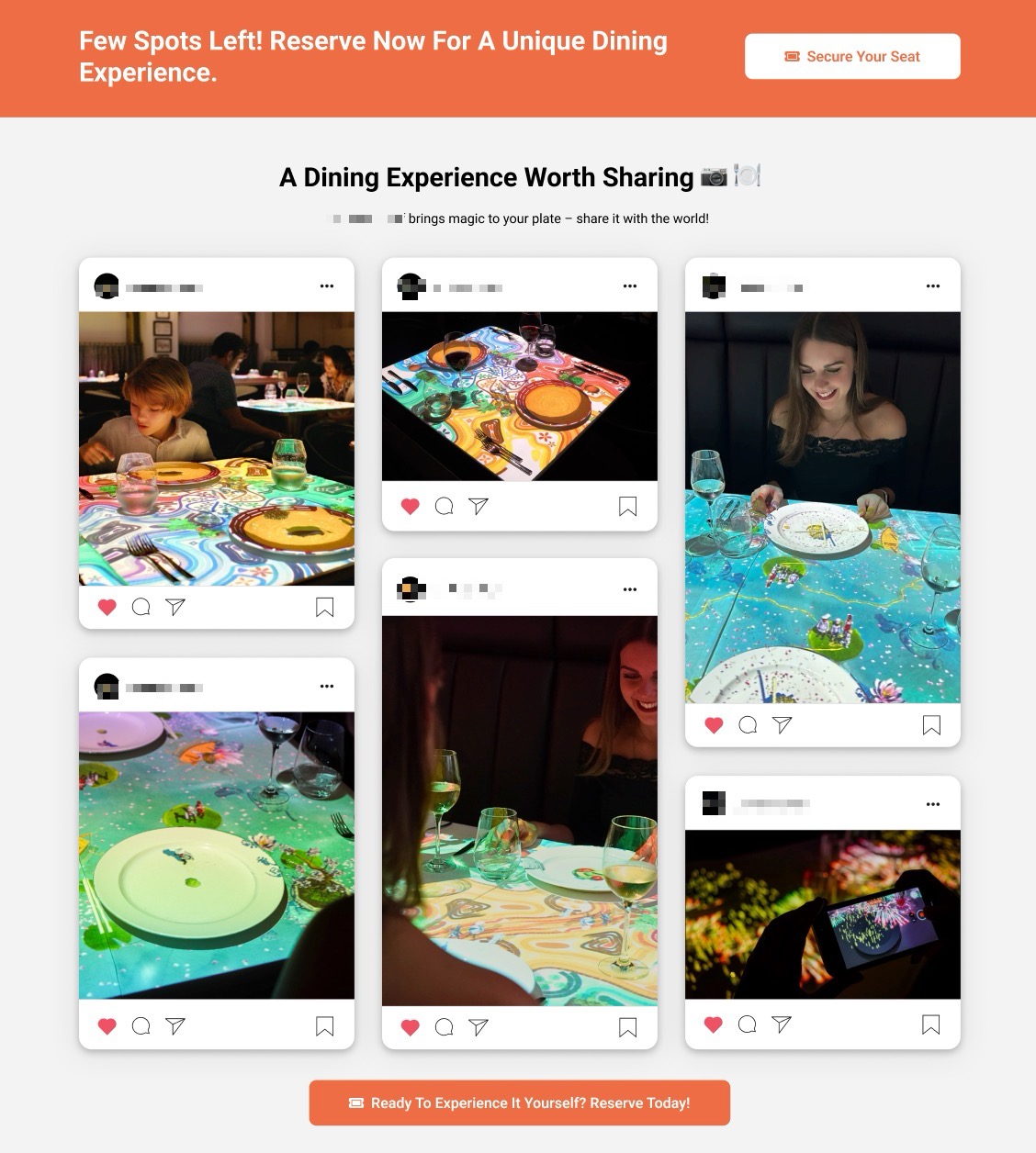
Visitors loved the concept but were confused by the offer. The value proposition wasn't clear, the booking flow was cluttered with too many options, and social proof—one of the brand's strongest assets—was buried.
The result: high interest, low bookings, and wasted ad spend.
Our Approach
We started with data. Session recordings, heatmaps, and analytics revealed where users hesitated and why. Three priorities emerged: simplify the message, remove friction, and make trust visible.
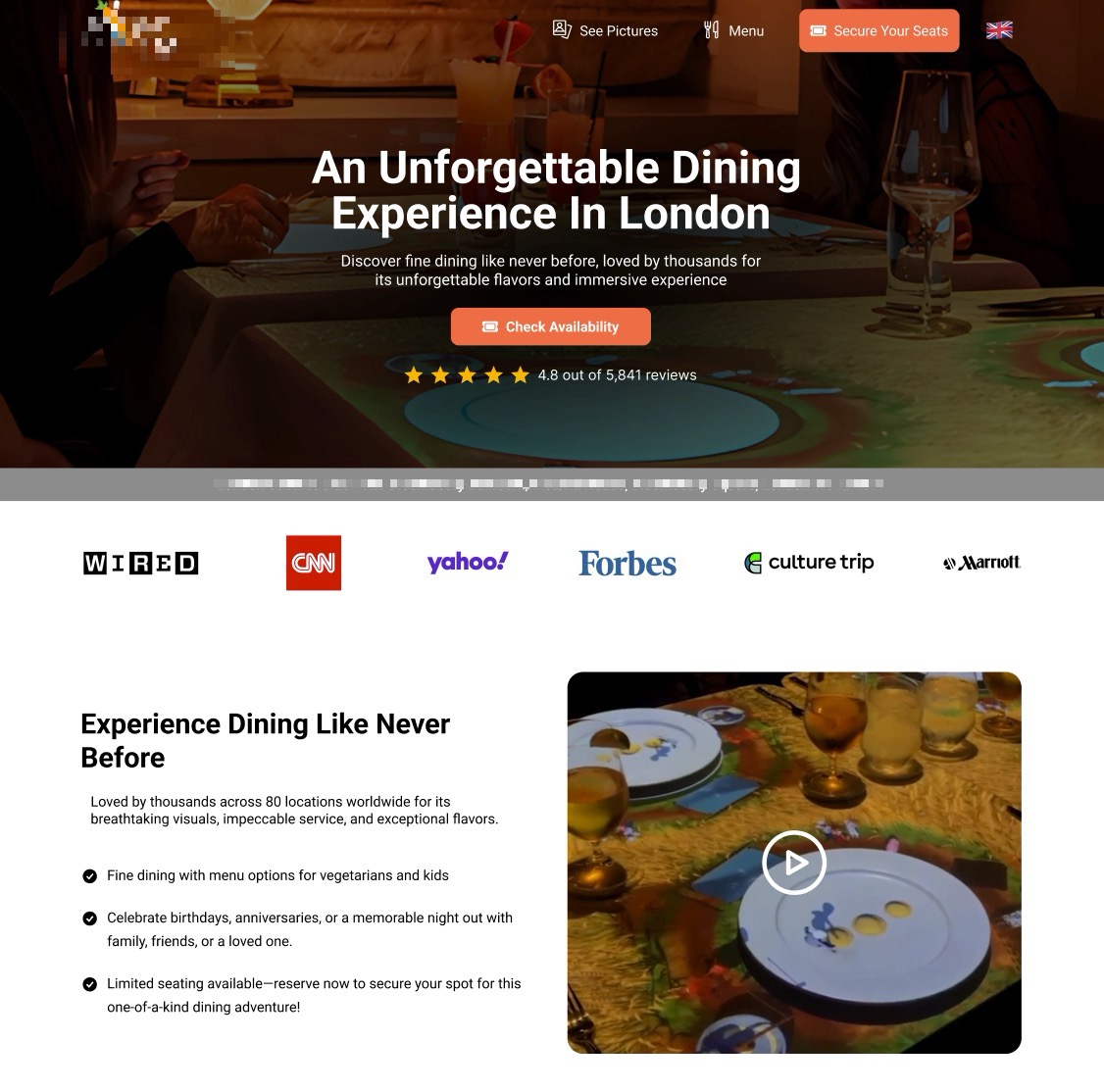
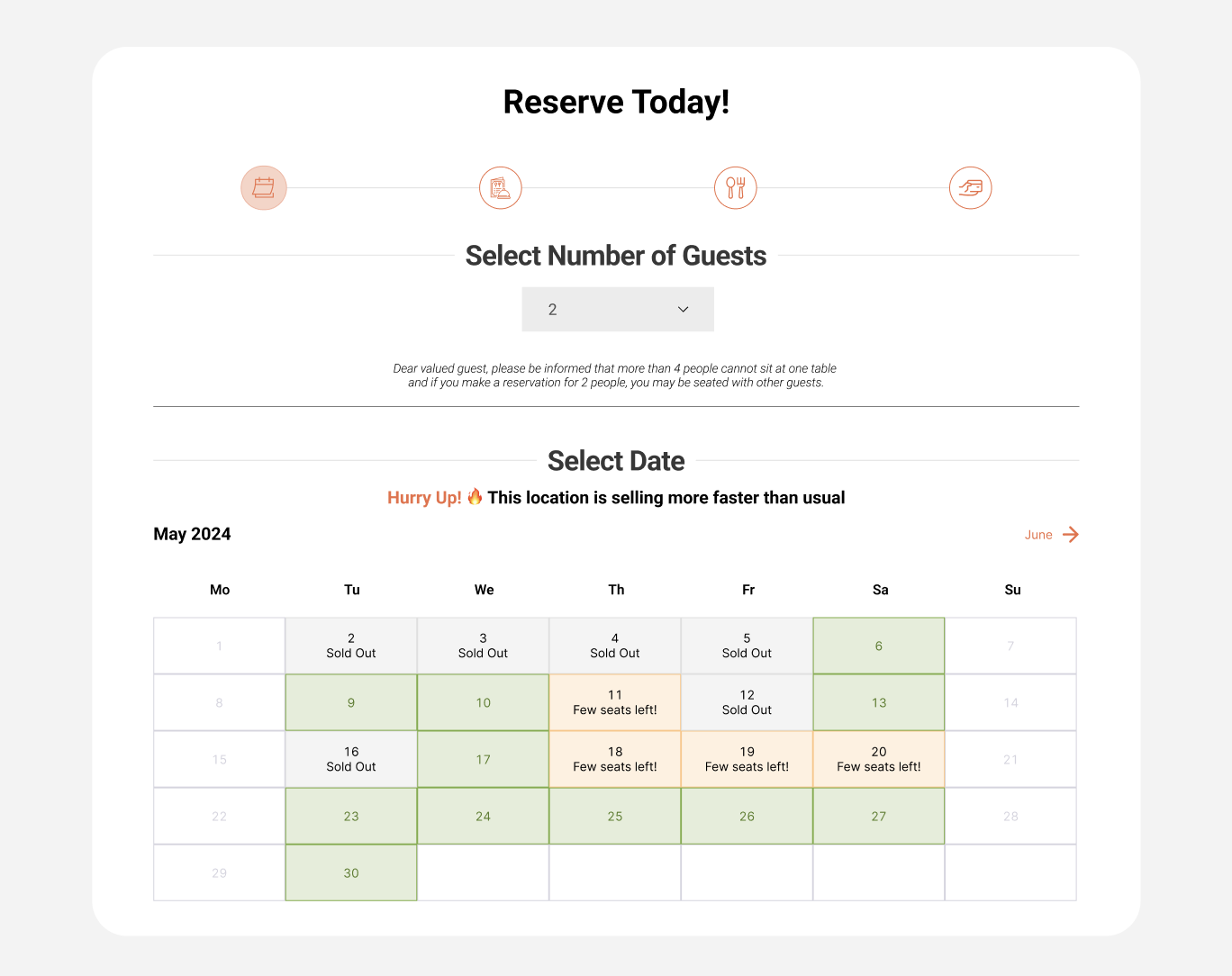
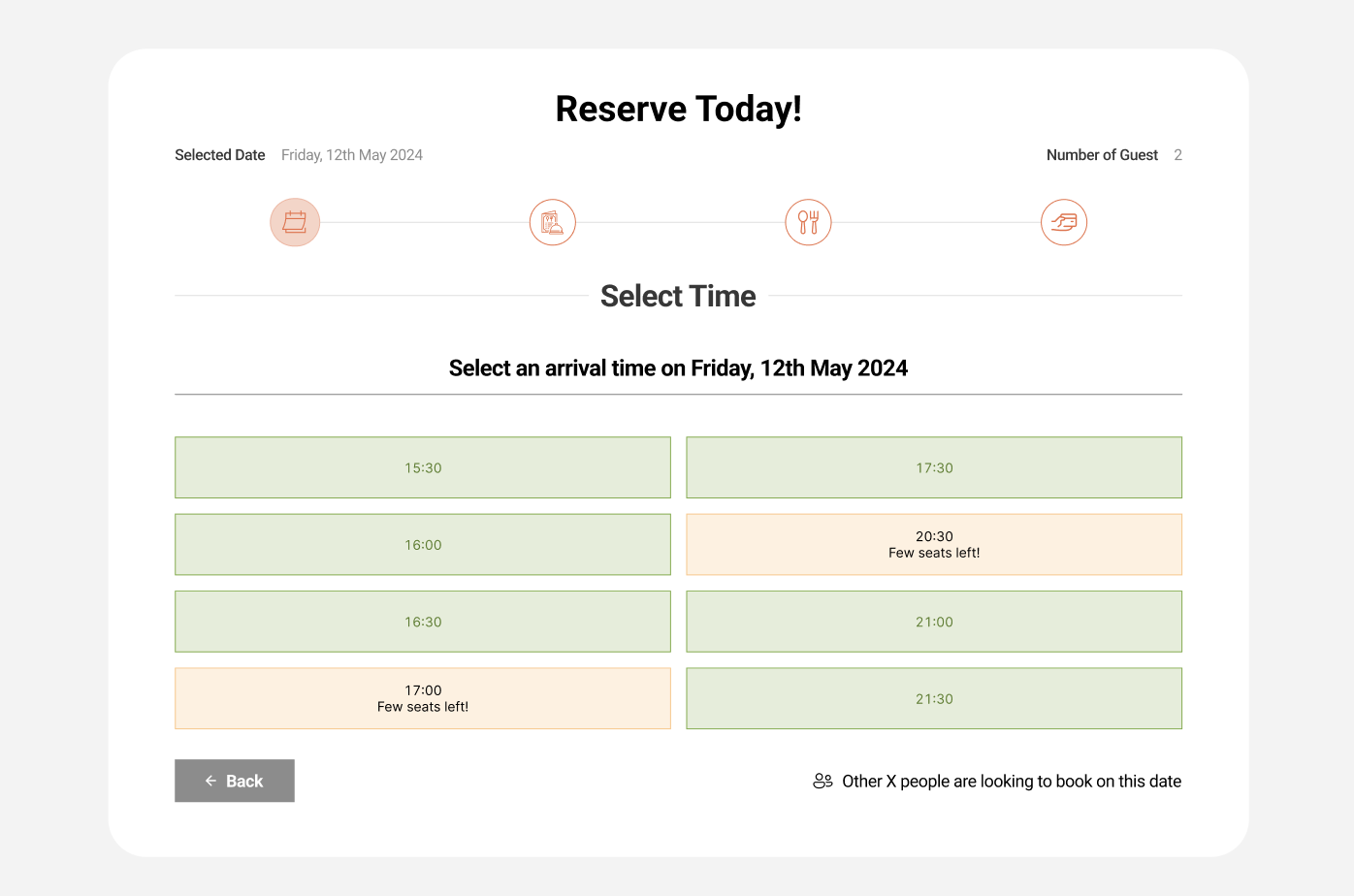
We redesigned the location page around a single promise: an unforgettable dining experience worth sharing. We clarified what the event is, who it's for, and what to expect—backed by social proof and strong CTAs. Next, we restructured the checkout to guide users step by step. Essential elements stayed visible; optional extras were moved deeper into the flow to reduce overwhelm.
Finally, we revamped the homepage, filling it with real guest photos, press mentions, and reviews—emotional proof that built trust before users ever clicked "Book Now."
Gallery
Location page — Figma design
Test setup
Test results detail
The Tests
Each change was validated through controlled A/B testing. The redesigned location page was tested against the original version using a 50/50 traffic split, with clear primary goals: booking start and completed transactions.
The checkout improvements were tested separately to measure drop-off reduction, and the homepage enhancements were validated through behavior metrics—engagement rate, time on page, and click-through to booking. All experiments ran until full statistical confidence was reached, ensuring the uplift wasn't by chance.
Result
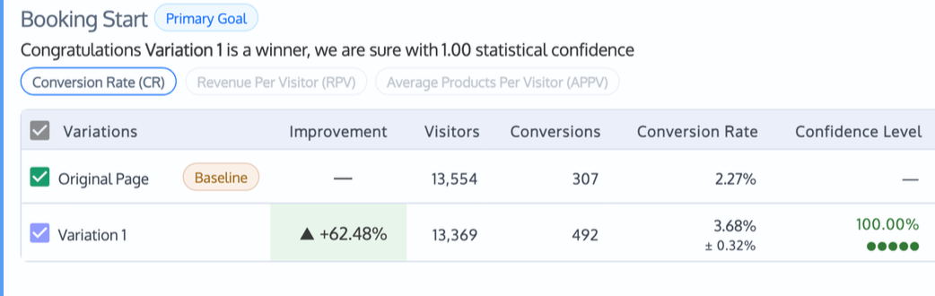
A/B test results
+62.48% booking start conversions (100% statistical confidence)
The redesigned location page achieved a +62.48% increase in booking start conversions, with 100% statistical confidence.
Checkout completion rates improved significantly, and bounce rates on the homepage dropped.
No new traffic. No extra ad spend. Just a refined user journey that helped people say "yes" faster.
By clarifying the offer and removing hesitation points, the brand turned existing visitors into paying guests—unlocking more revenue from the traffic they already had.
Ready for Your Own Results?
Schedule a call. We'll review your funnel and show you what's possible.
SCHEDULE A CALLFree strategy session