A CRO audit answers one thing: why visitors don't convert. No guesswork. You use data, behavior, and a structured look at the pages to see where people drop off and what to test next. Most audits flop because they hand you a fat PDF of opinions and zero clarity on what to do first. Below is the exact process we use to turn any site into a prioritized test list. We've run it on 100+ audits across ecommerce, SaaS, and lead gen.
- What a CRO audit is and why the output should be a testing roadmap, not just a report
- An 8-step process: workspace, data-first analysis, product conversion rates, funnels, heatmaps, structured page review, mobile, and prioritization
- A simple page-review framework: clarity, motivation, trust, and friction
What Is a CRO Audit
A CRO audit is a structured look at your site to answer: why aren't people converting, and what could we test to fix it? No fluff. Just a clear path from "conversion is broken" to "here's what to test first."
A solid audit leans on three things:
- Analytics (where the numbers leak)
- Behaviour (what people actually do on the page)
- A structured page review (why the page might be losing them)
The real output
Nobody needs another 40-page PDF that sits in a drawer. The goal is a prioritized testing roadmap: a short list of experiments, in order, so you know what to ship next.
Why CRO Audits Matter
Lots of brands try to grow by turning up the traffic tap. But if the site converts like a sieve, you're just pouring more water in. Better conversion flips the maths: same traffic, more revenue. Lower cost per customer. Better payback on ads.
So the rule of thumb: fix the leak before you scale the spend. CRO before you double the budget.
The CRO Audit Process We Use
We break it into four chunks: data, behavior, page review, then prioritization. Below we walk through each step so you can copy the playbook.
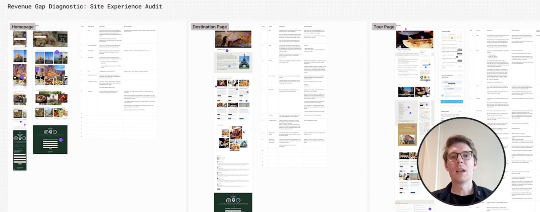
Step 1: Combine Everything Into One Workspace
First we get everything in one place. No 80-page PDF. We use something like FigJam so the whole team can see the same board: homepage, category pages, product pages, checkout. Desktop and mobile, side by side.
Then we annotate. Each note says: "this might be the problem, here's what we could test." Slowly you get a map of ideas pinned to the exact spot on the page. But before we scribble ideas everywhere, we answer one question: where are people actually struggling? That comes from data.
Step 2: Start With Data, Not Opinions
Plenty of audits start with someone staring at the site and saying "that button looks wrong." That's the wrong order. You need to know where the biggest leaks are before you start redesigning buttons.
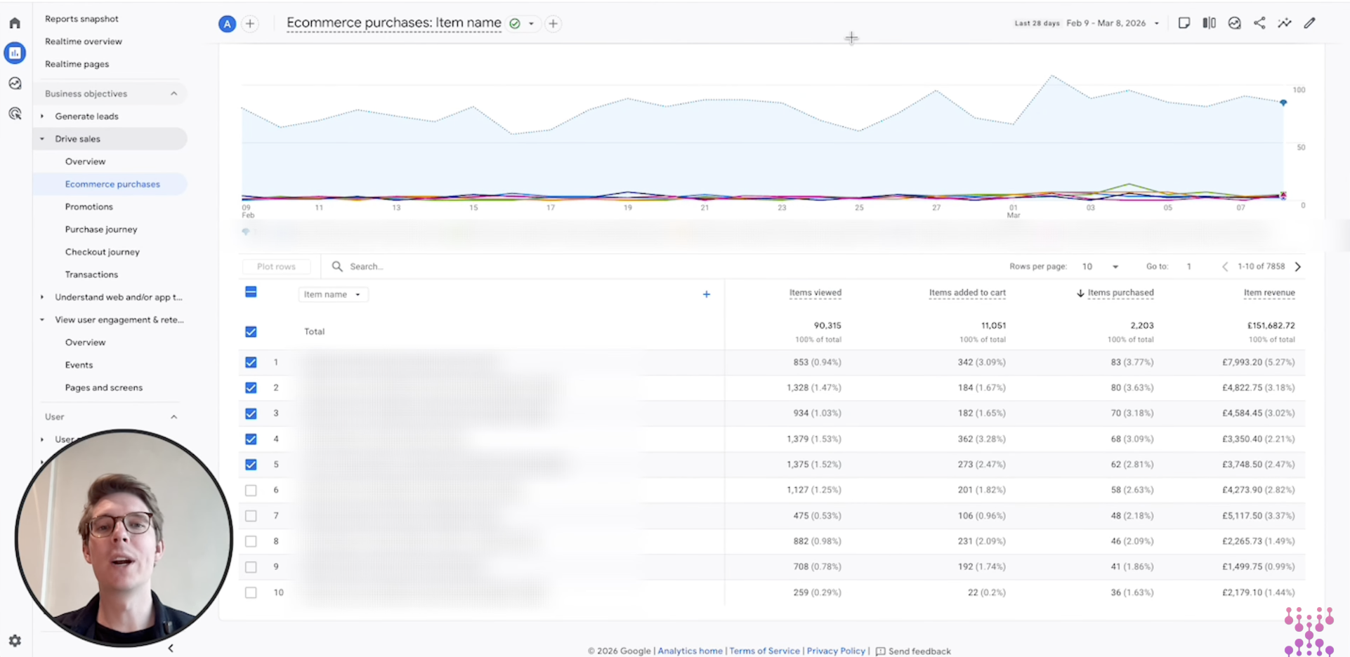
GA4 (or whatever you use) can tell you. For ecommerce, the product performance table is gold: views, add-to-carts, purchases. Don't fixate on your bestsellers. Look for the opposite: products that get tons of views and almost no add-to-carts. Those pages are usually where the low-hanging fruit lives.
You can slice this by product, category, or variant. Rule of thumb: high traffic, low conversion = optimize there first. You only have so much dev time; spend it where the volume is.
Step 3: Analyze Conversion Rates by Product
Out of the box, GA4 gives you big numbers. What you want is ratios. Lots of teams pipe GA4 into Looker Studio or BigQuery so they can see view-to-cart rate, cart-to-purchase rate, and full product conversion. Those percentages tell you where the funnel is healthy and where it's choking.
Simple read: if a product gets 10,000 views and 50 add-to-carts, the problem is probably on the product page (messaging, trust, or "add to cart" itself). If add-to-carts are strong but purchases tank, the leak is likely in checkout. You're just narrowing the search.
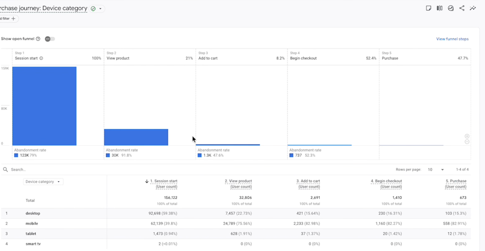
Step 4: Use Funnel Reports to Find Where People Bail
Think of the funnel as a pipe: session, product view, add to cart, checkout, purchase. Where the pipe narrows the most is where you look first. GA4's funnel report shows you exactly that.
If 80% of people never see a product page, your navigation or homepage is the suspect. If they add to cart then vanish at checkout, the problem is in the last mile (forms, trust, or payment). Segment the funnel by device, country, or traffic source and you'll often spot big gaps. Mobile and desktop behave like different sites; that's where a lot of quick wins hide.
Step 5: Use Heatmaps to See What People Actually Do
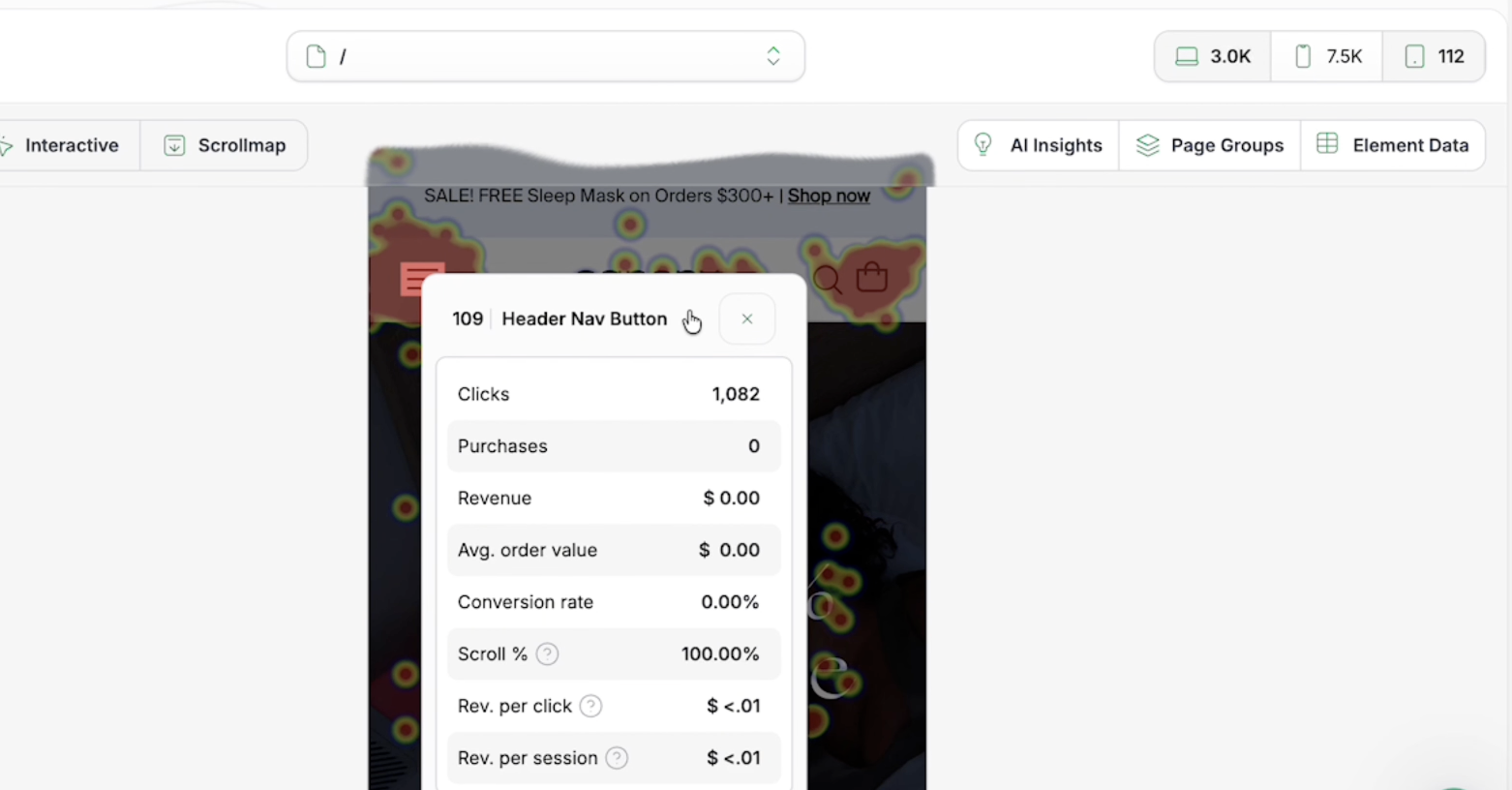
Analytics tells you what happened. Heatmaps show you where people clicked, how far they scrolled, and what got their attention. It's like an X-ray of the page. Microsoft Clarity does this for free; fancier tools can tie clicks to revenue so you see which elements actually convert.
Classic find: a nav item that gets thousands of clicks and zero purchases. Maybe it doesn't deserve prime real estate. Or you spot people hammering something that isn't clickable. That's a usability leak. Heatmaps turn "we think the layout is wrong" into "here's the evidence."
Step 6: Run a Structured Page Review
Data tells you where it hurts. The page review tells you why. We use four lenses: clarity, motivation, trust, and friction. Run through them on any key page and you'll have a short list of "might be wrong" in minutes.
Clarity
Can someone land on the page and in a few seconds get: what is this, who it's for, and why it's worth it? If not, the page is working too hard. Bullets, a clear headline, and a one-line value prop go a long way.
Motivation
Why should they act now? Stock running low, free shipping, a discount, or "ends Sunday" all nudge people off the fence. Without a reason to move, they'll bounce and "come back later" (they won't).
Trust
Do they believe you? Reviews, ratings, guarantees, and familiar logos answer that. A product page with no social proof is like a stranger asking for your card details. Add proof where the doubt is.
Friction
Anything that makes the next step harder. Confusing size guides, slow load, a checkout that feels like a tax form, or key info buried in tabs. Fix friction first; it's usually the fastest win.
Step 7: Treat Mobile as Its Own Beast
On most stores, mobile is half the traffic or more. But the experience is nothing like desktop. Stuff is in accordions, images swipe, and the CTA might be three scrolls down. So we always review mobile on its own. Often the biggest gains live there: one tap instead of three, a sticky add-to-cart, or copy that actually fits the screen.
Step 8: Turn Ideas Into a Testing Roadmap
By now you've got a pile of ideas. You can't test them all. So you rank. We score each one on two things: how big could the impact be, and how much effort to ship? Big impact, low effort = top of the list. That's your roadmap for the next few weeks. The audit stops being a document and becomes the backlog.
Why this bit matters
Without prioritization, everyone picks their favorite idea and nothing gets done. A clear list gets alignment: "we're testing these five next." Score by impact and effort, then lock in the next 4 to 8 weeks of tests.
Ready to stop guessing?
Book a free 24‑hour CRO audit and we’ll show the top three fixes you can implement this week.
If you prefer a guided approach, we offer a short engagement that includes research, prioritized roadmap, and two implementation-ready experiments.
Why CRO Actually Moves the Needle
Traffic is expensive. Conversion is a multiplier. Lift the rate and you get more revenue from the same spend, better ROAS, and often higher AOV and repeat buys. That's why brands that scale invest in CRO before they double down on ads.
Wrap-Up
A good CRO audit doesn't end in a deck. It ends in a short list: "test this, then this, then this." Data tells you where to look, behavior tells you what's wrong, and the page review tells you what to change. Do that and the audit becomes the first sprint of a real CRO program.
FAQ
What is a CRO audit?
A structured look at your site to find why people don't convert and what you could test to fix it. The output should be a prioritized list of experiments, not just a report.
How long does a CRO audit take?
Anywhere from a few hours to a few days, depending on site size and how deep you go. A single funnel can be audited in an afternoon; a full store takes longer.
What tools do you use?
GA4 (or similar), product performance and funnel reports, heatmaps (e.g. Clarity), and sometimes session replays. The exact stack depends on what you already have.
What do you get at the end?
A testing roadmap: a ranked list of experiments so you know what to ship first. Optionally a shared workspace (e.g. FigJam) with the key pages and ideas pinned to them.